 Akshay Deshpande
Easy to understand
Plain-language directions, no cryptic icons, and larger text throughout.
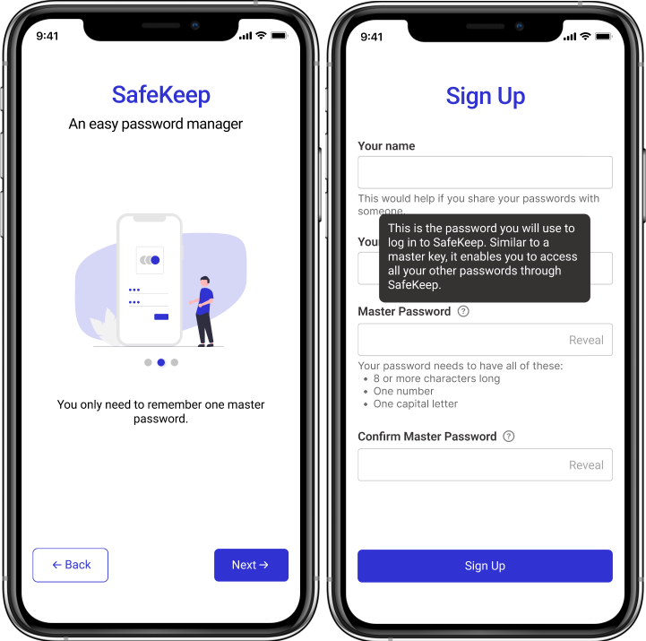
A simple, secure password manager for people who aren't comfortable with technology, and for the family members who help them.
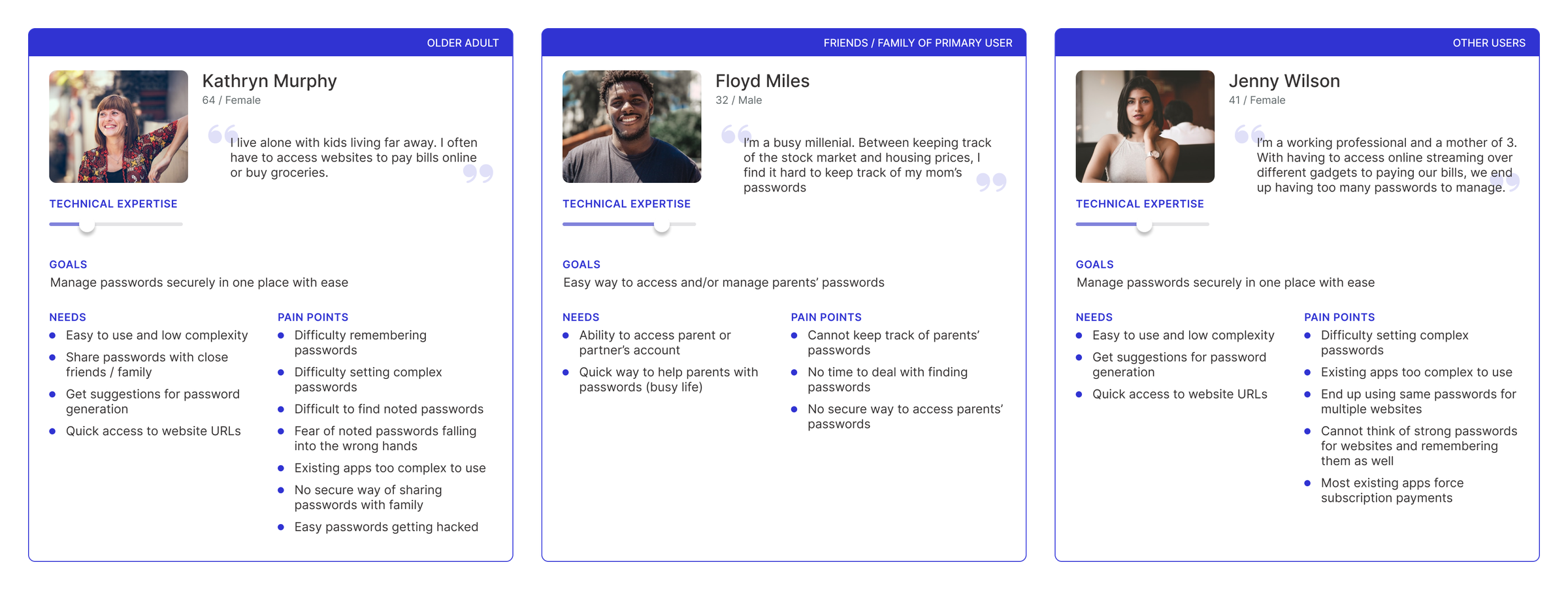
The pandemic pushed many older adults online for groceries, healthcare and banking. Every service needs a password. Writing them in a notebook or reusing one everywhere is convenient but not secure.
Many older parents also rely on their children for help, and those children often live far away. Reading passwords out over the phone or texting them isn't secure either.
Problem statement
How might we make it easy to securely manage passwords, and share them with close family or friends when needed?
I surveyed older adults and their adult children about how they manage passwords and phone security.
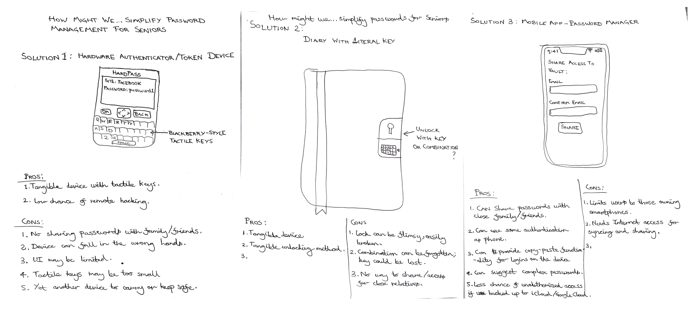
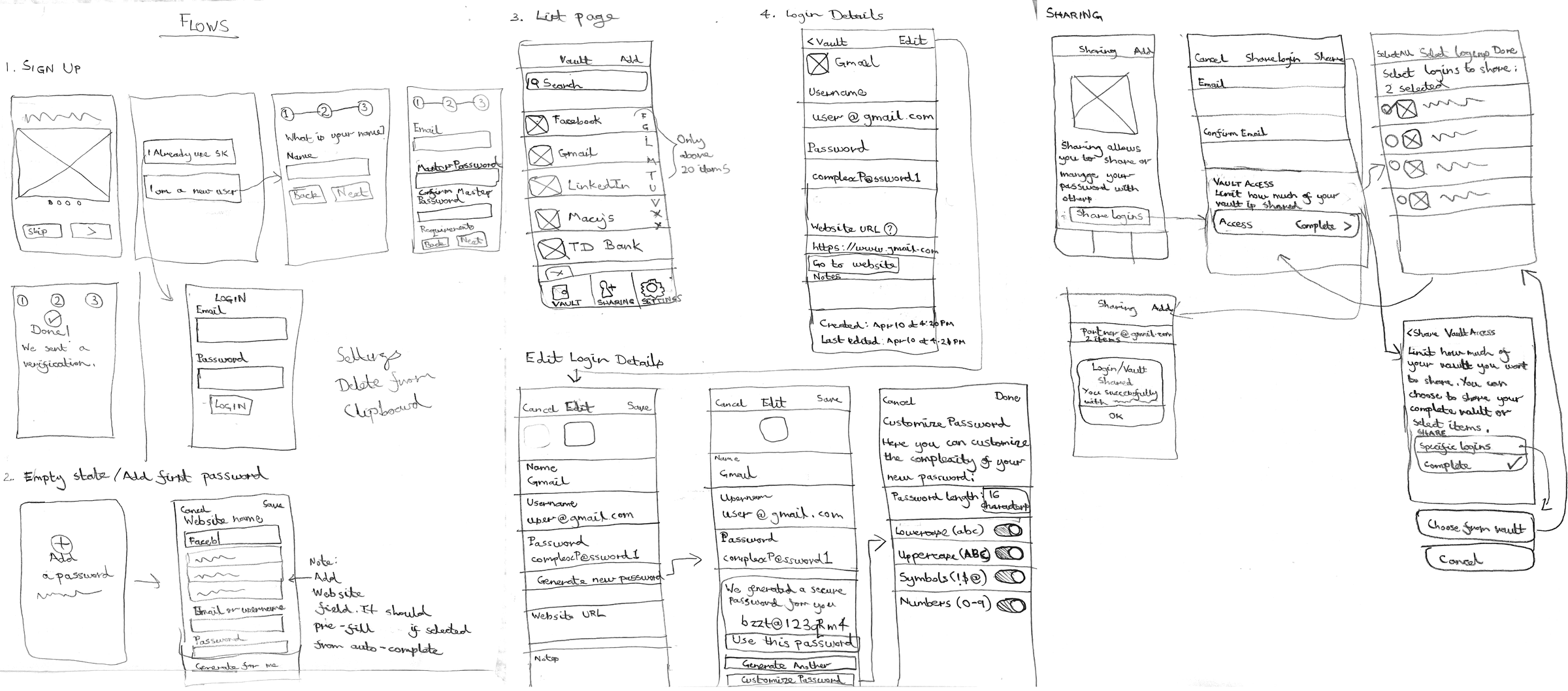
I sketched three possible solutions, Crazy 8s style. I chose a smartphone app because phones are everywhere, they already have fingerprint and face unlock, and sharing between family members is easiest on devices everyone owns.
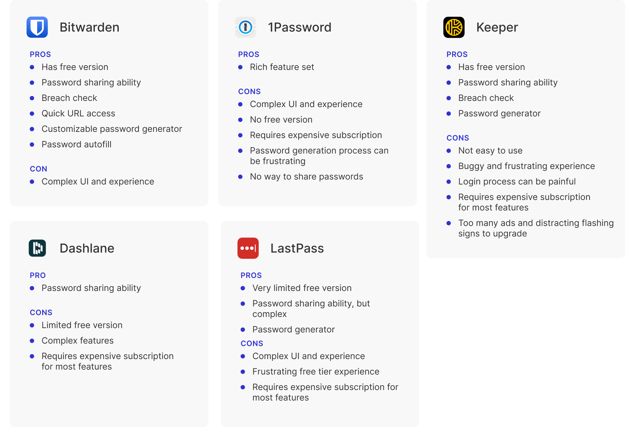
Popular password managers had three common problems: expensive subscriptions, complicated interfaces full of jargon, and little or no way to share passwords.
Usability testing
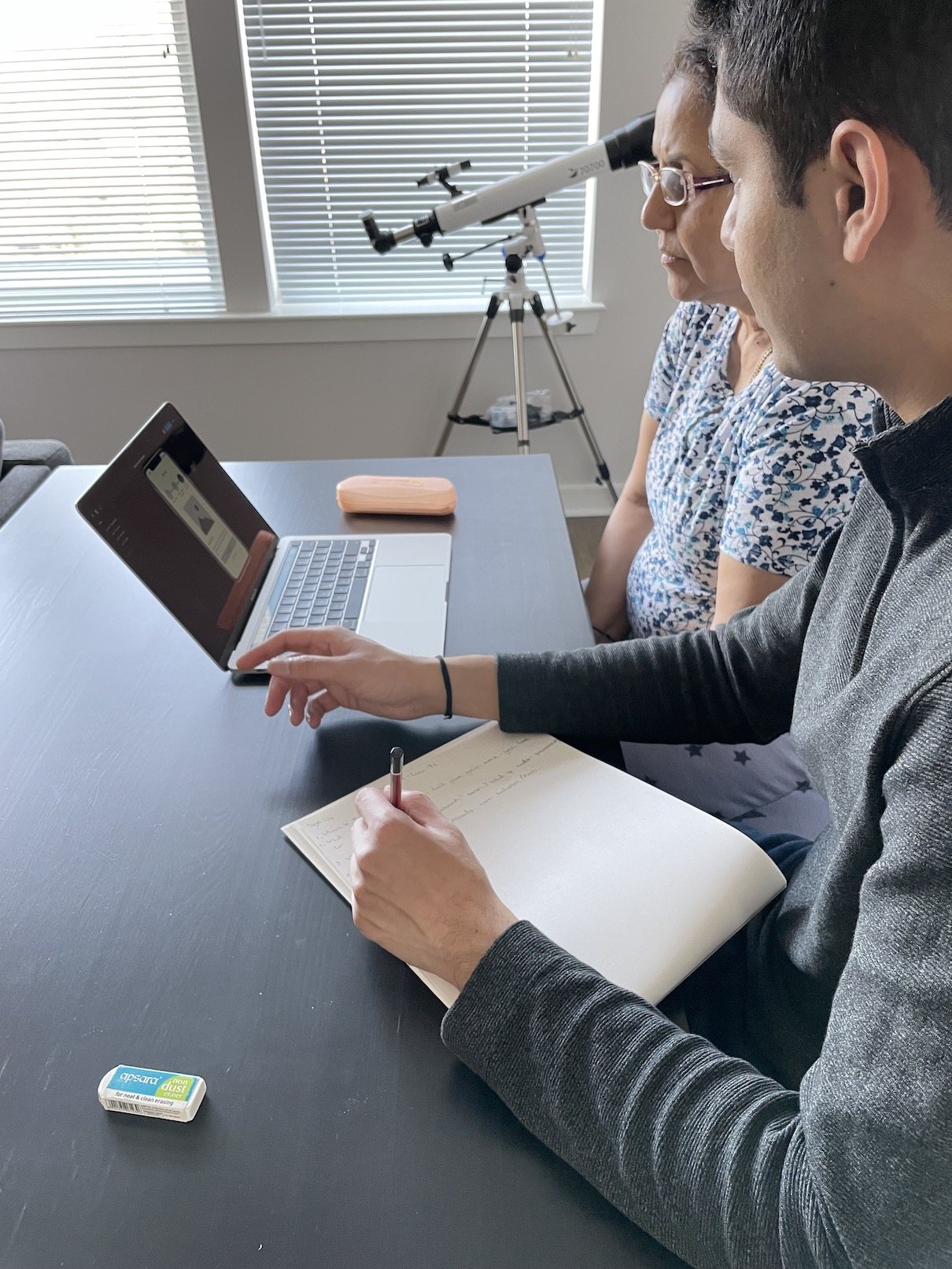
I tested a low-fidelity Figma prototype with two older adults using the think-aloud method. Things I'd assumed were universal turned out to be anything but.
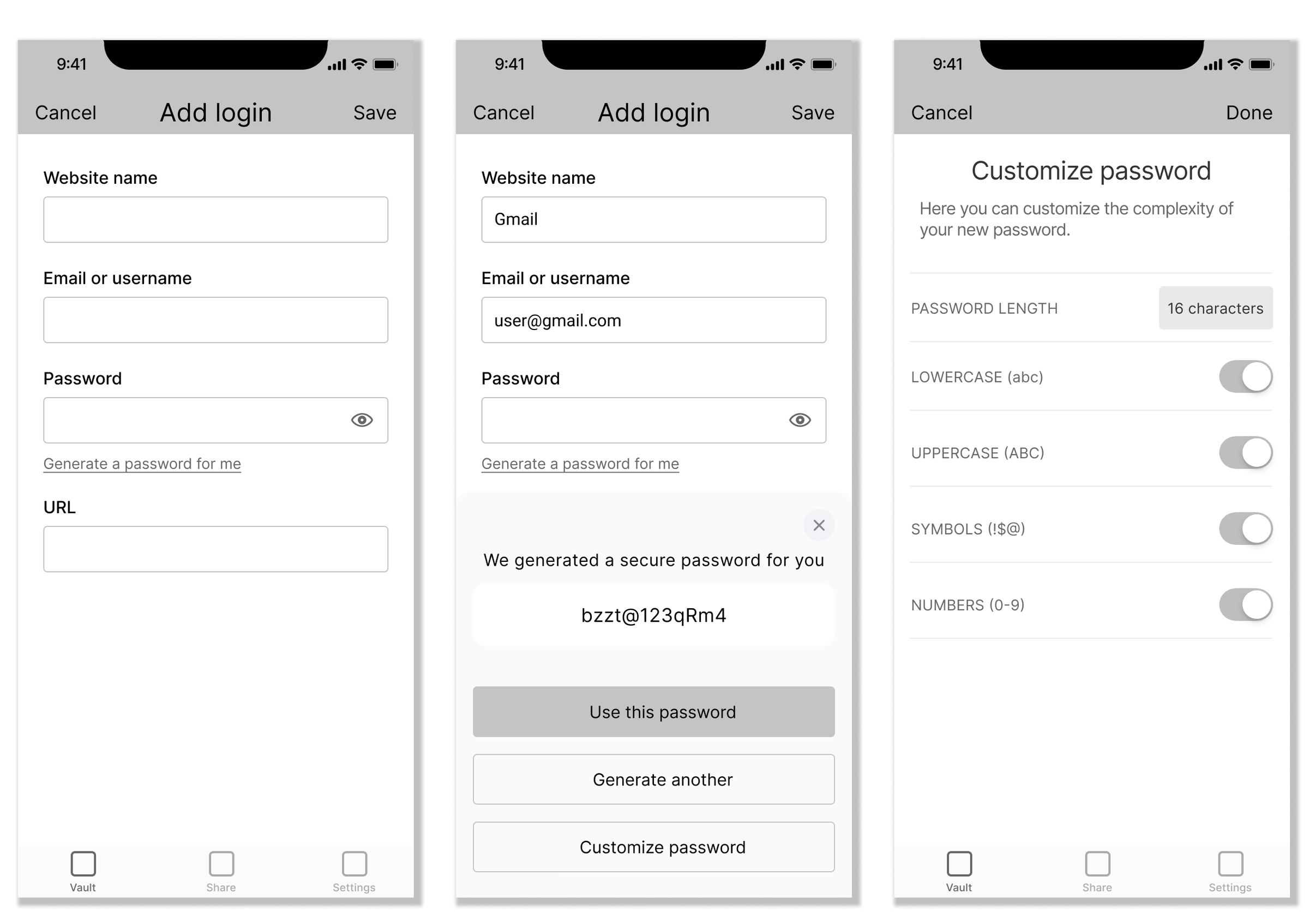
I refined the design based on what testers told me, then built high-fidelity prototypes in Figma.
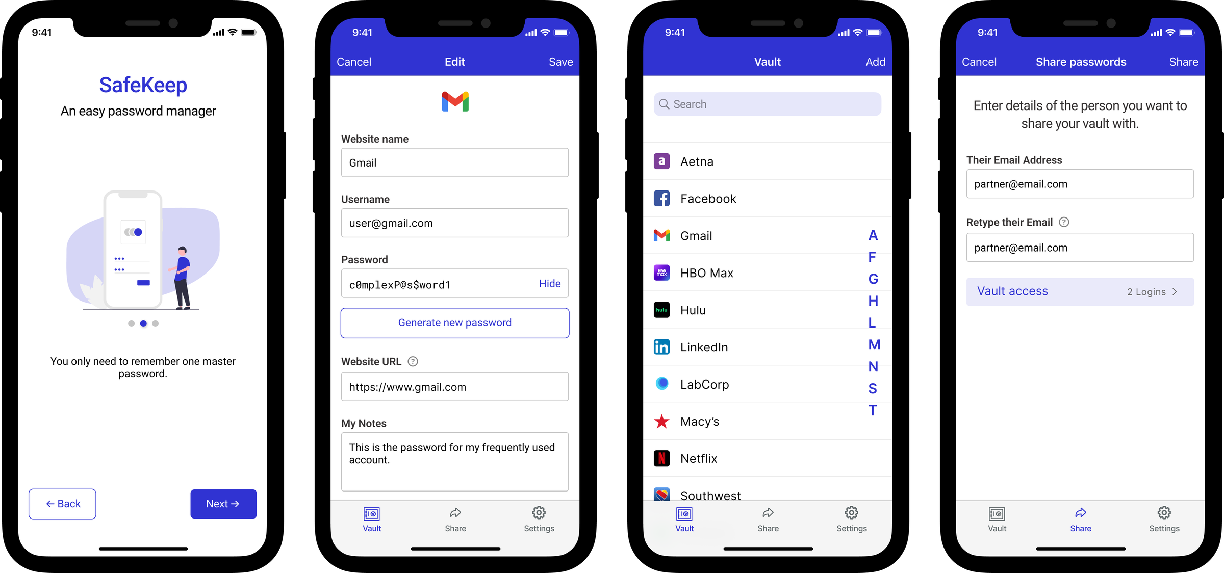
Plain-language directions, no cryptic icons, and larger text throughout.
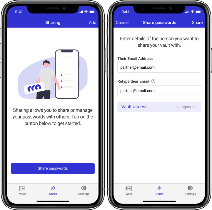
Share a few or all logins with chosen people: healthcare and utilities for older parents, streaming accounts for everyone else.
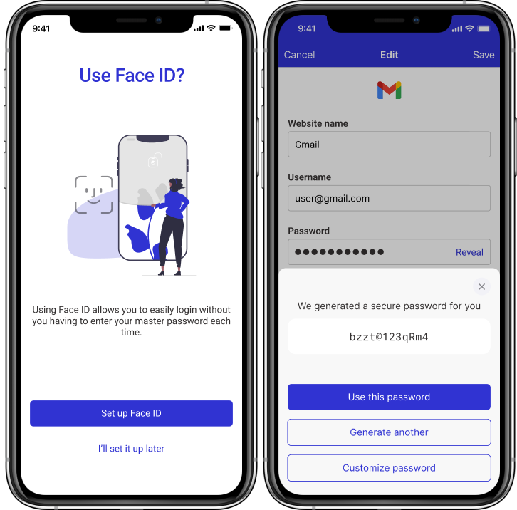
Suggests strong passwords and uses the phone's own fingerprint or face unlock. Data could be stored encrypted in the user's own iCloud or Google Drive.
It's easy to assume patterns younger people understand are understood by all. Testing proved otherwise.
Technology should be understandable to older adults and anyone unfamiliar with it, not just usable.
Testers expect every screen to work and every detail to match. A clickable prototype's fidelity has to be planned.