Type: Personal Experiment
Tools: Claude Code, DesignPowers Skills, Figma MCP, HTML/CSS
Status: Prototype Complete
When I recently visited Australia, I noticed a genuine gap in the rental market after talking to friends and family about their renting experience:
- Renters sign year-long leases with almost no reliable information about the building they're moving into.
- No ratings. No reviews from the people who've already lived there.
- Extremely high competition: 30-50 applicants for desirable units.
- Expectation to make a decision based on a 15-minute "inspection" of the unit done with 50 other people.
- A system that generally works against renters.
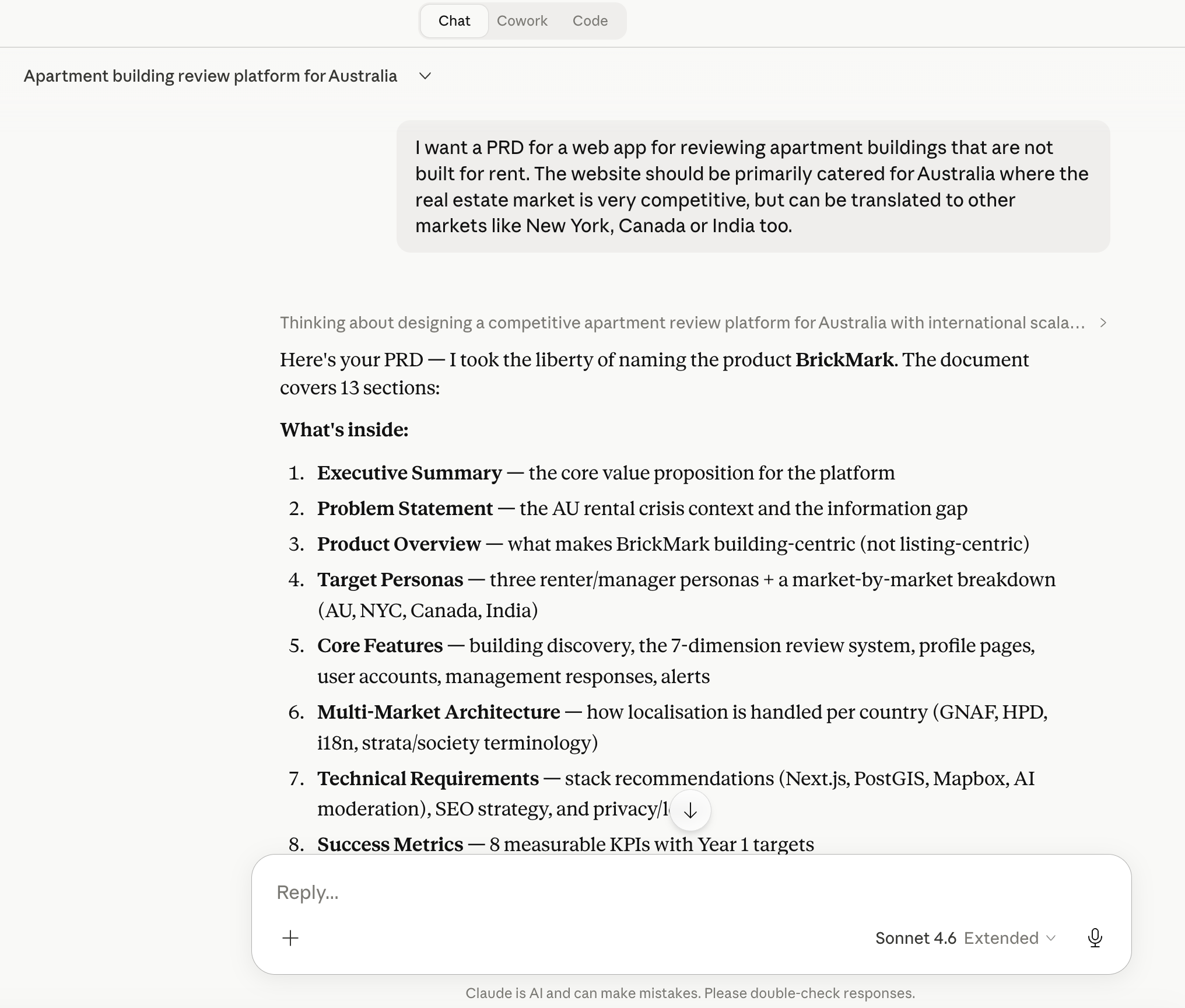
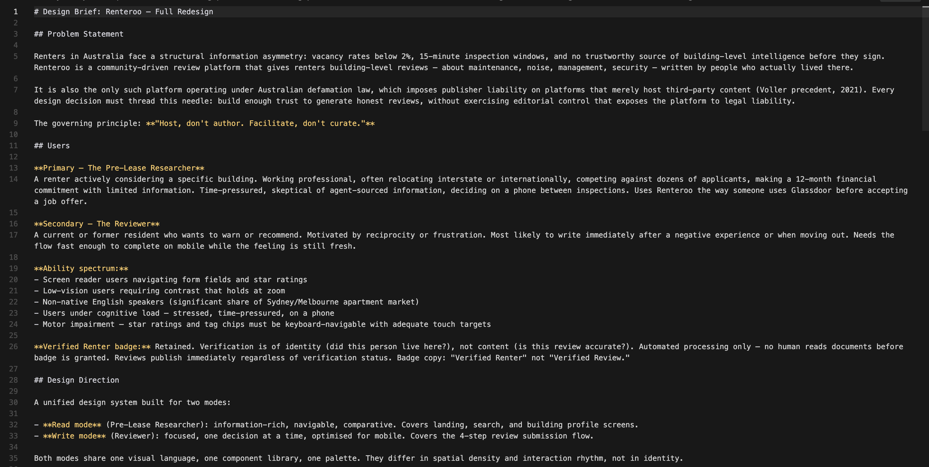
I used my idea to solve this as a test bed for AI-assisted design: first building the product brief, legal framework, and first-generation prototypes through Claude Code, then running a full redesign through DesignPowers, a structured multi-agent design workflow system that uses Claude Skills. The result is eight production-quality HTML/CSS prototype screens and extensive documentation of every product and design decision made along the way.
Steps 1-7 · PRD, legal research, design system, Figma wireframes, HTML prototypes
Problem description
Described the problem and pain points to Claude
PRD generation
Full Product Requirements Document from a problem description
Legal deep dive
Why this doesn't exist in Australia - Voller precedent, no Section 230
Design constraints
5 Facilitator Design Principles from the legal landscape
Design system
Microsoft Fluent 2 analysis: tokens, type, elevation, accessibility
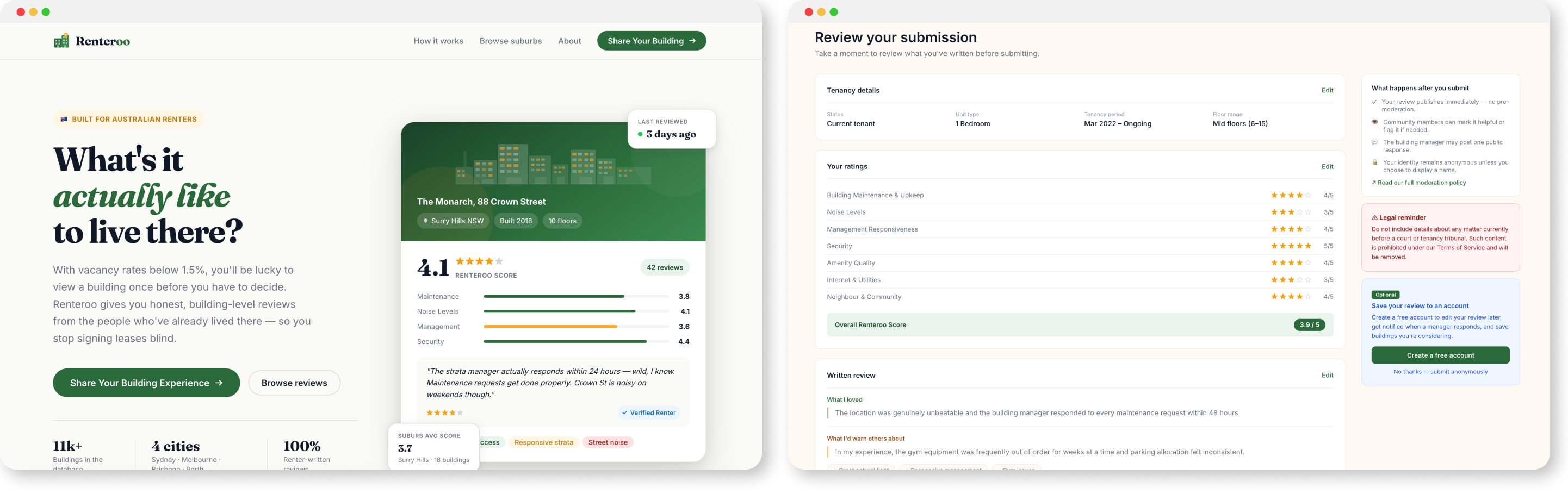
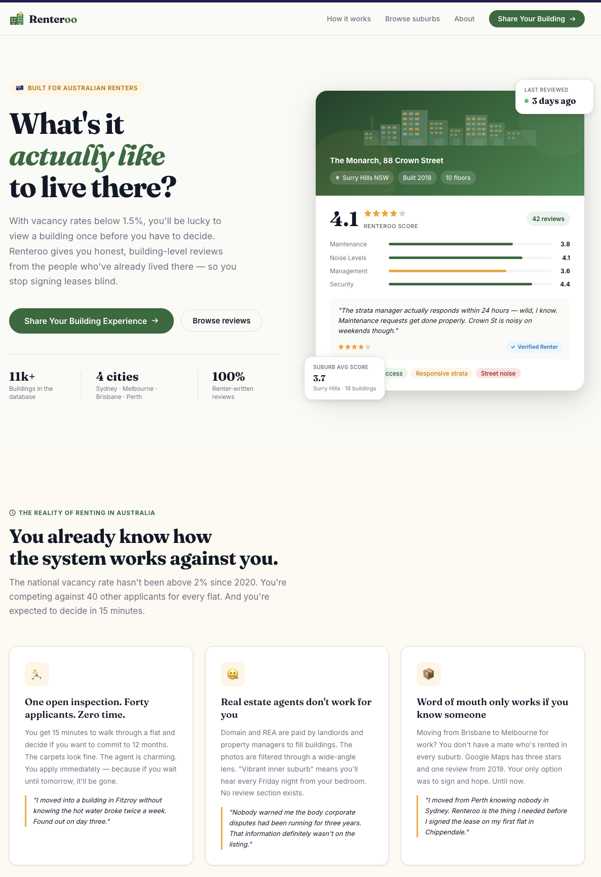
Landing page
Built in Figma via Figma MCP with Claude Code
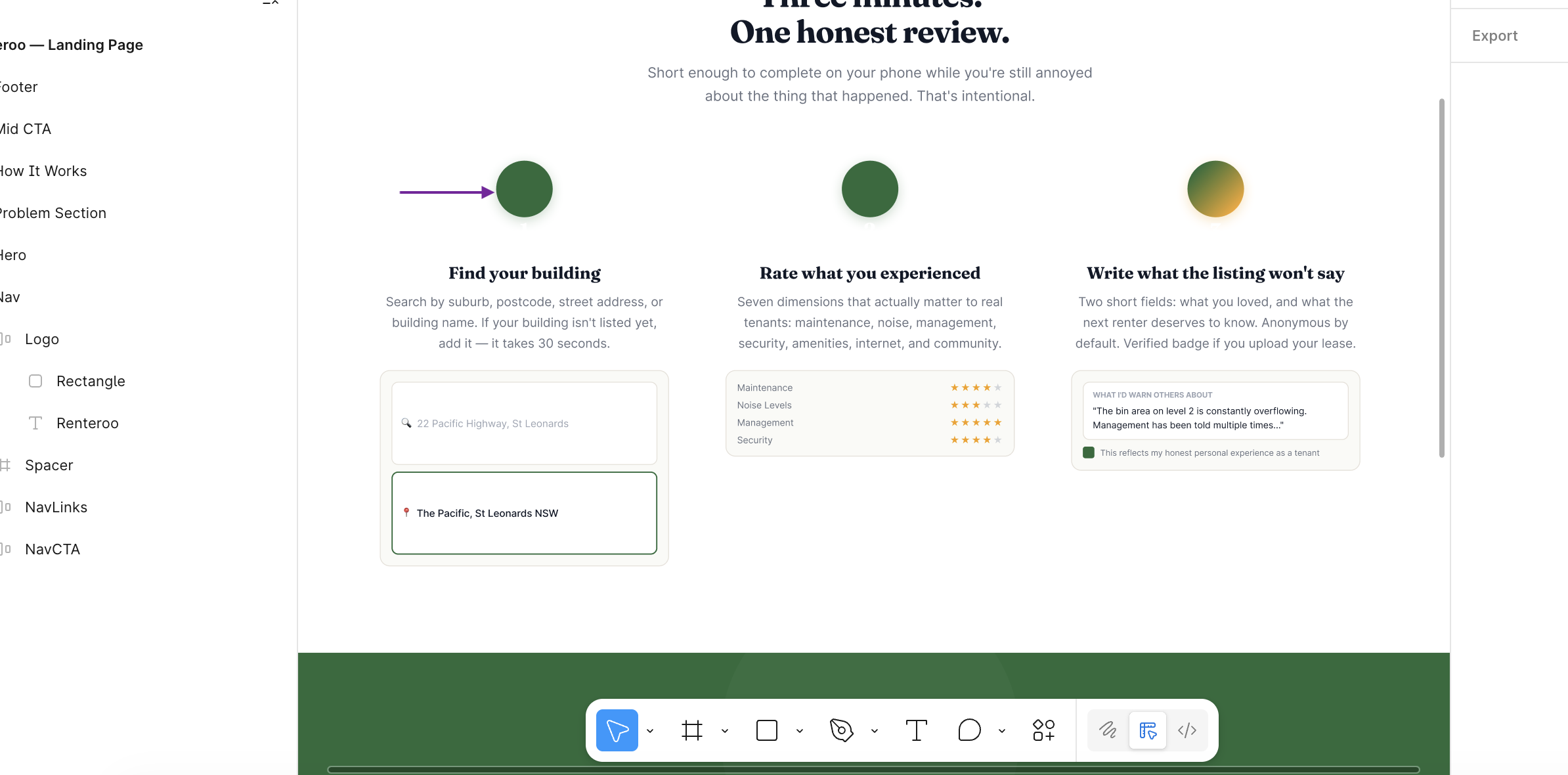
Review workflow
4-step review flow prototyped in HTML/CSS with Claude Code
I began by describing the problem and the pain points I wanted to solve, along with a high-level concept: a community-driven review platform focused specifically on residential apartment buildings. Not individual units, not listings, not agents, but the buildings themselves.
national vacancy rate since 2022
leases signed after a single inspection
structured renter-generated building review platforms in AU
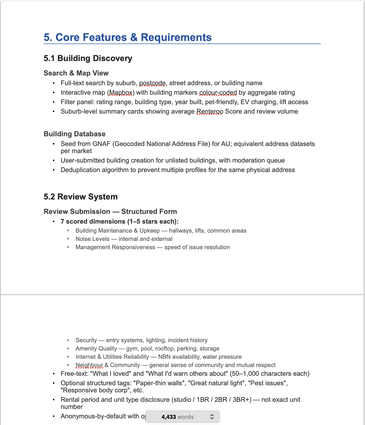
From this problem description, I asked Claude to produce a full PRD covering personas, core features, multi-market architecture, technical stack, success metrics, a phased roadmap, monetisation strategy, and a competitive landscape. I then edited the PRD manually to add more detail or update certain details that it had incorrectly assumed.
| Competitor | Focus | Gap vs. Renteroo |
|---|---|---|
| Domain / REA Group | Rental listings | Agent-incentivised; not building-centric; no tenant reviews |
| Google Maps | POI reviews | Unstructured; sparse for residential; no renter-specific dimensions |
| Openigloo (NYC) | Building reviews | US only; not available in AU or other markets |
| RateYourLandlord | Landlord reviews | Landlord-focus, not building-focus; limited AU scale |
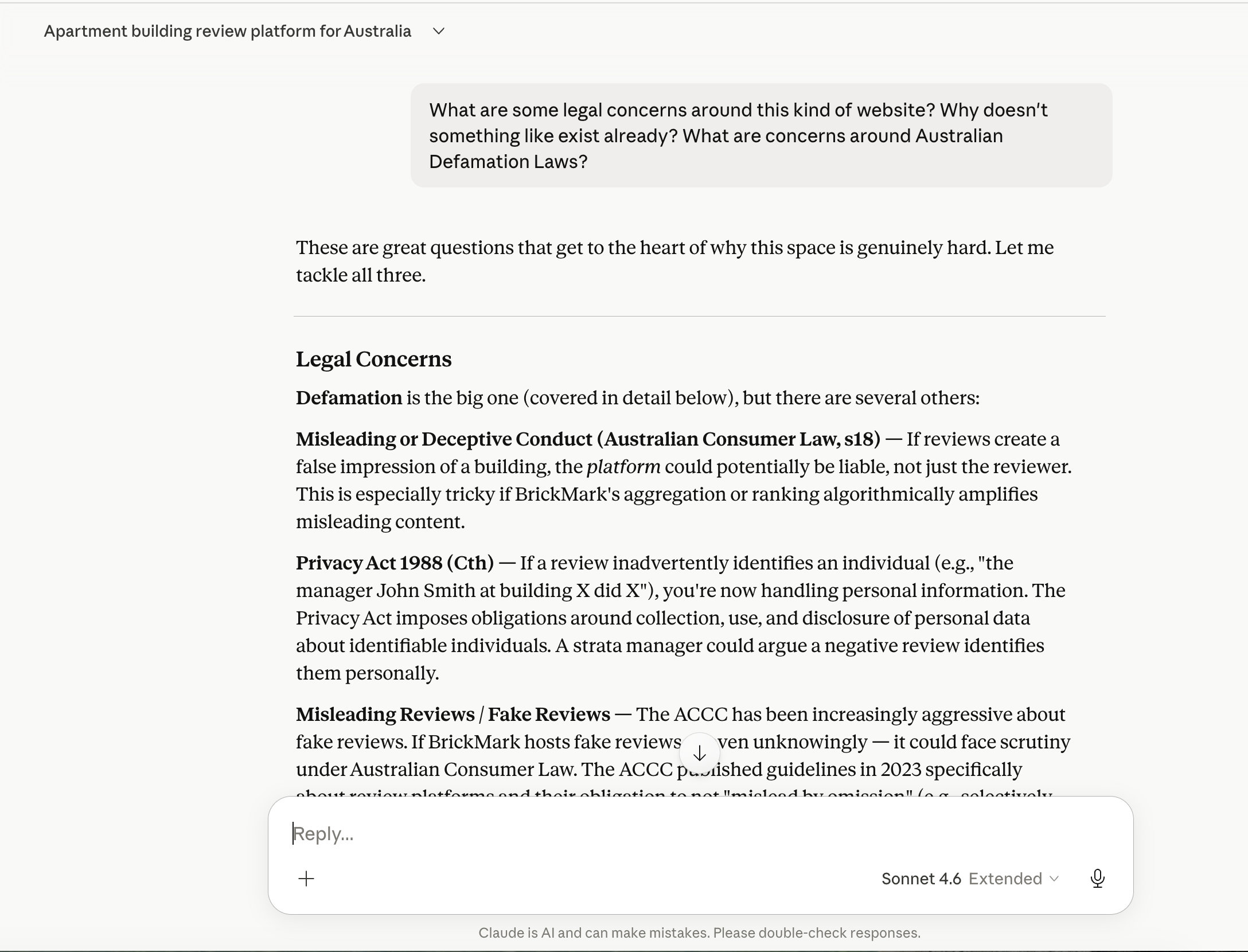
Before designing anything, I asked Claude: if renters clearly need this, why hasn't a well-funded team built it? The answer reshaped the entire product.
The Section 230 gap
Australia has no equivalent of Section 230 of the US Communications Decency Act: a foundational law protecting online platforms from liability for user-posted content. An Australian platform can be held liable as a publisher of content it merely hosts. The 2021 High Court decision in Fairfax Media Publications v Voller made this worse, a party can be a "publisher" of third-party comments simply by creating the environment that facilitated them.
Translating legal risk into design: the 5 Facilitator Design Principles
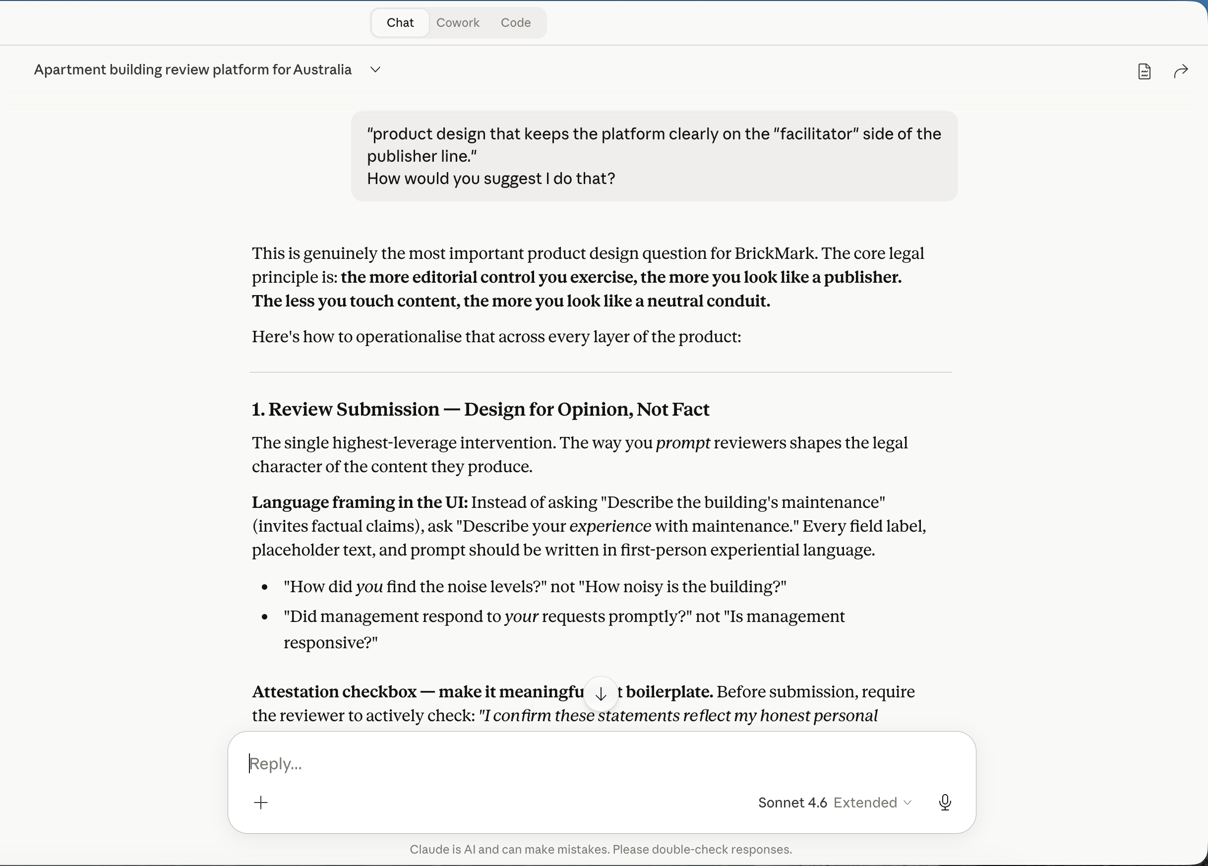
First-person framing
"How did you find the noise levels?" not "How noisy is the building?" Every prompt references the reviewer's experience, not an objective claim.
Structured fields over free text
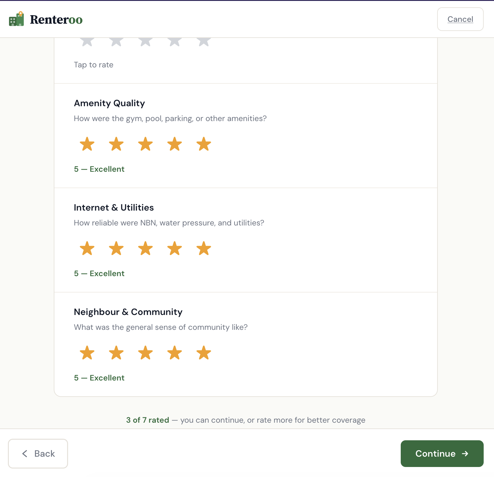
Star ratings and predefined tags are opinion-based by nature. Free text is supplementary, not the primary vehicle.
No pre-moderation
Reading reviews before publication signals editorial control. Renteroo publishes immediately, with reactive flagging only.
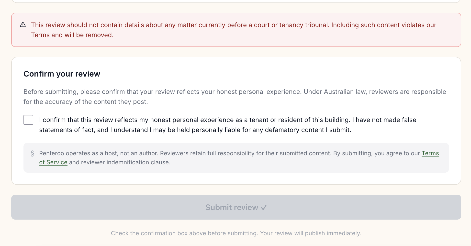
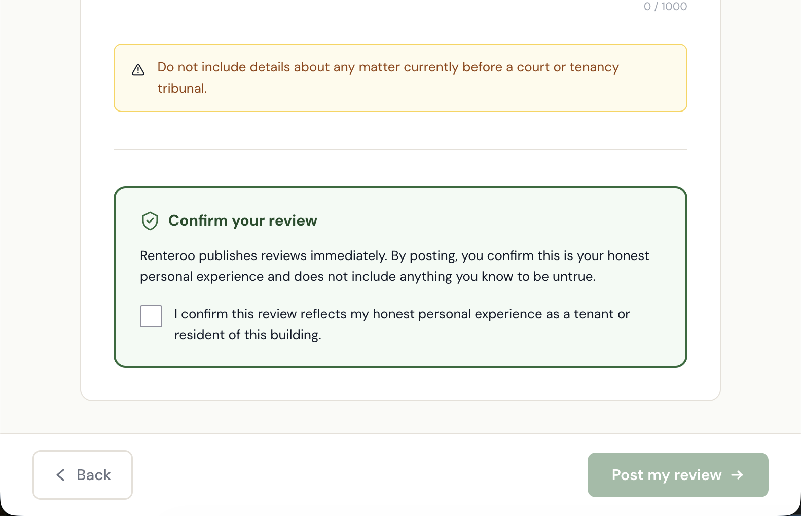
Active attestation
An unchecked checkbox — the last action before submission — confirming honest personal experience. Not pre-checked. Not buried in Terms.
No reviews of named individuals
The platform reviews buildings, not people. Auto-detection flags submissions containing name patterns, the narrow exception to the no-pre-moderation rule.
"Host, don't author. Facilitate, don't curate."
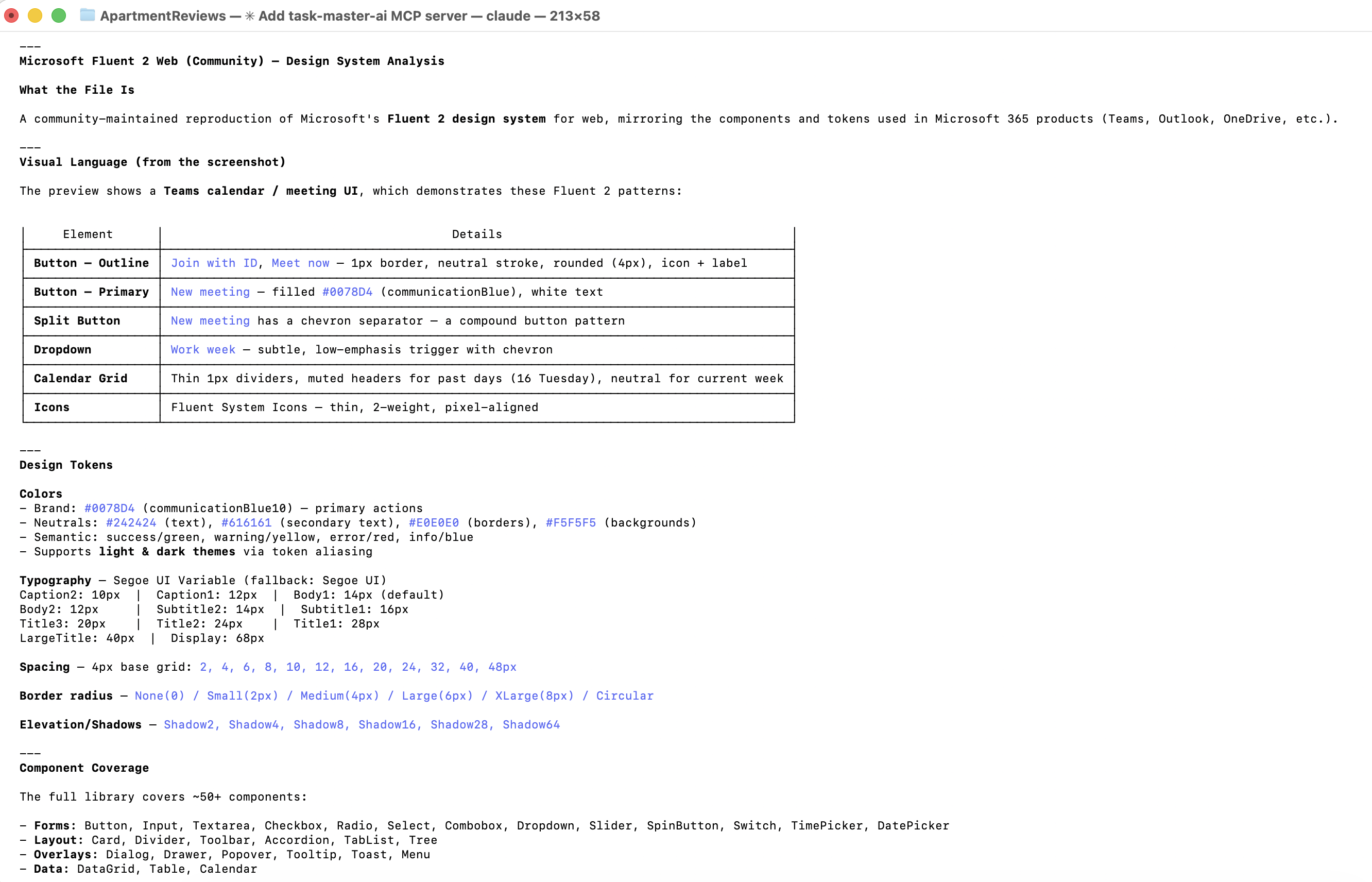
With PRD and legal constraints documented, I chose Microsoft Fluent 2 as the visual foundation — its structured, data-dense components and WCAG 2.1 AA baseline suited a trust-first platform. However, since I don't have an enterprise level subscription, Claude was unable to access the variables and other advanced features within Fluent. I had Claude generate a custom design system in the style of Fluent, with tokens, type styles, elevation guidelines, and accessibility annotations.
Claude built the landing page in Figma via the Figma MCP server, then iterated on a four-step review submission flow in HTML/CSS, each screen shaped directly by the Facilitator Design Principles. I then translated the pages in Figma using Figma MCP, so I could make small changes without going back to Claude for every tweak and saving on tokens.
Issues faced
There were a few issues with the translation of Claude's designs to Figma via Figma MCP:
- Layout shifts: many components experienced layout shifts during translation, requiring manual fixes.
- Missing elements: some elements, particularly icons and smaller components, were missing after translation and had to be manually re-added.
- Inconsistent naming: some layers and components were renamed during translation, making it difficult to track changes and maintain consistency.
8 screens · Shared design system · Multi-agent review · Synthetic user testing · Verification
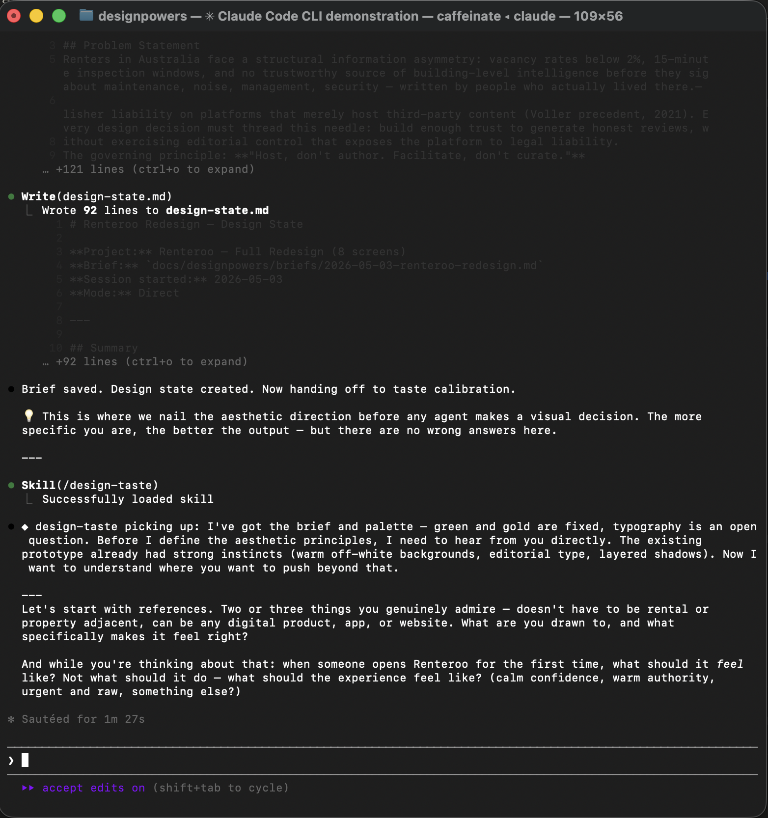
DesignPowers is a system of design agent skills that run inside Claude Code. Rather than generating designs in a single pass, it runs a structured workflow with the designer acting as creative director at each handoff. This is an experiment in understanding what that workflow looks like in practice, with Renteroo as the test case.
The goal: redesign all existing screens from scratch, add a missing building profile screen, unify everything into a shared CSS design system, and run the output through critique, accessibility review, heuristic evaluation, and synthetic user testing before declaring it done.
screens redesigned
shared CSS file
review agents run in parallel
personas tested
Each phase below, click to expand.
The discovery phase produced a formal design brief from the PRD and legal context. Key decisions made:
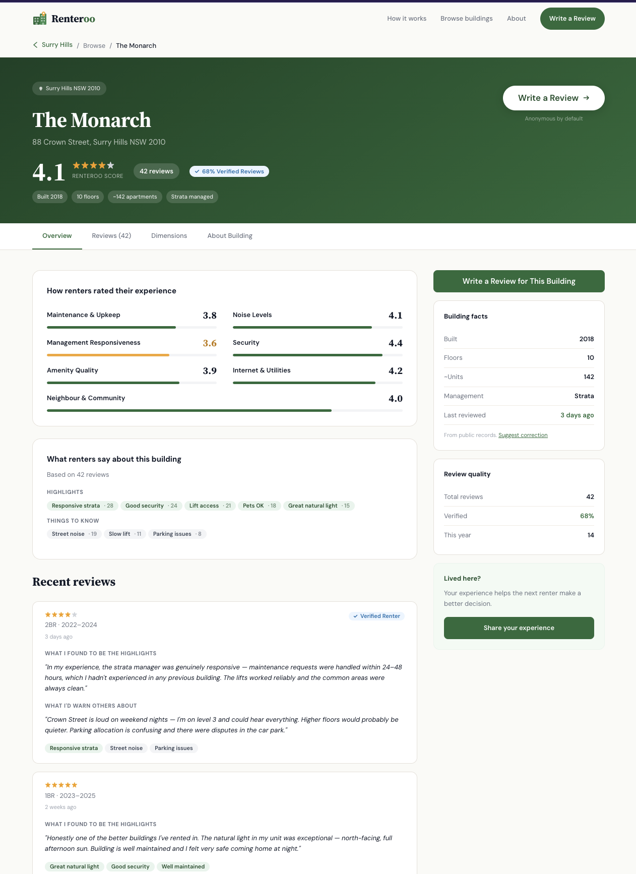
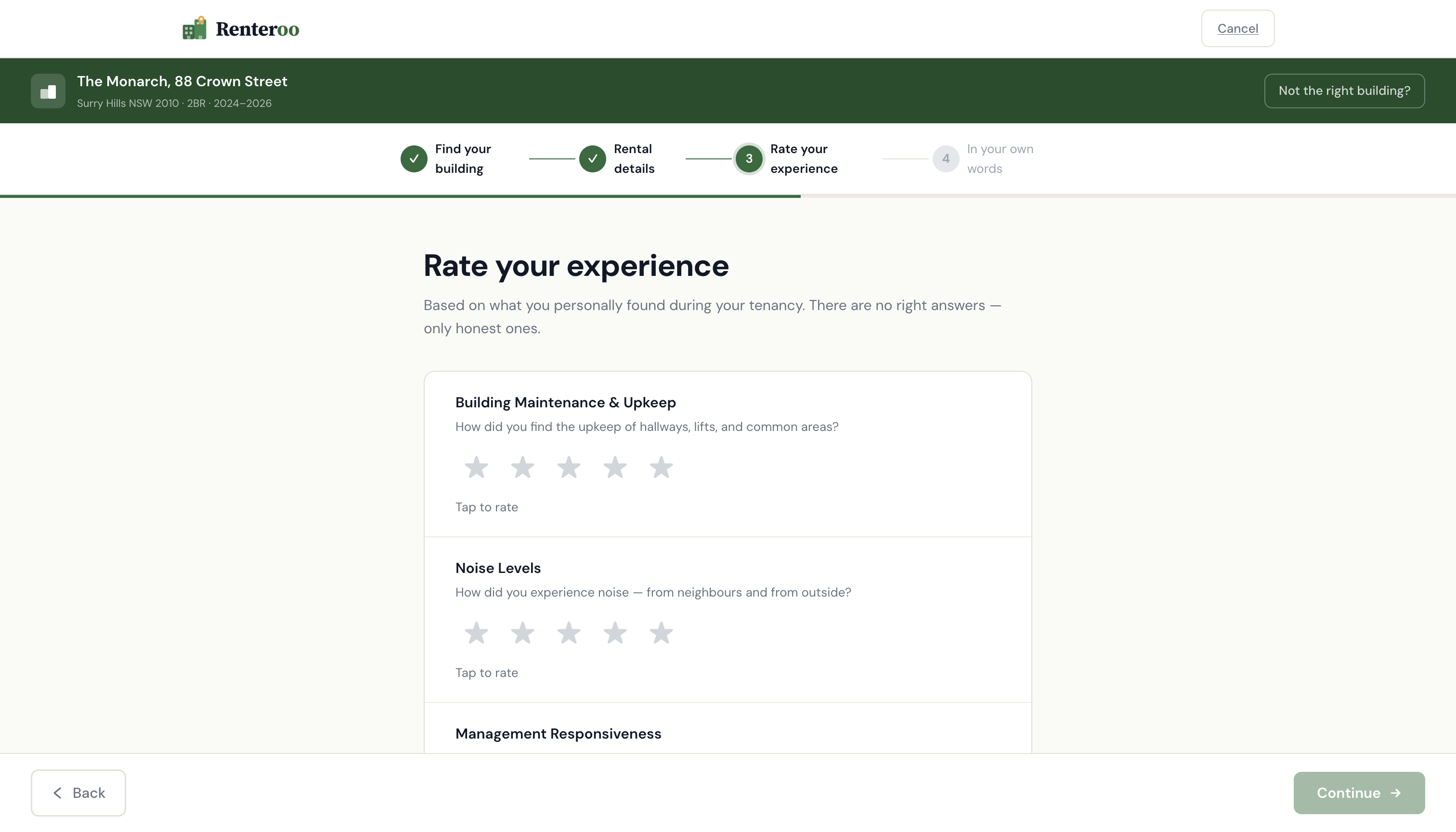
- Two modes: Read (Pre-Lease Researcher: browse, compare, decide) and Write (Reviewer: fast, focused, mobile)
- New screen added: Building Profile: the missing centrepiece that all other screens orient around
- Verified Renter badge retained: verifying identity ≠ editorial control; automated processing only, no human reads documents
- Shared CSS: single
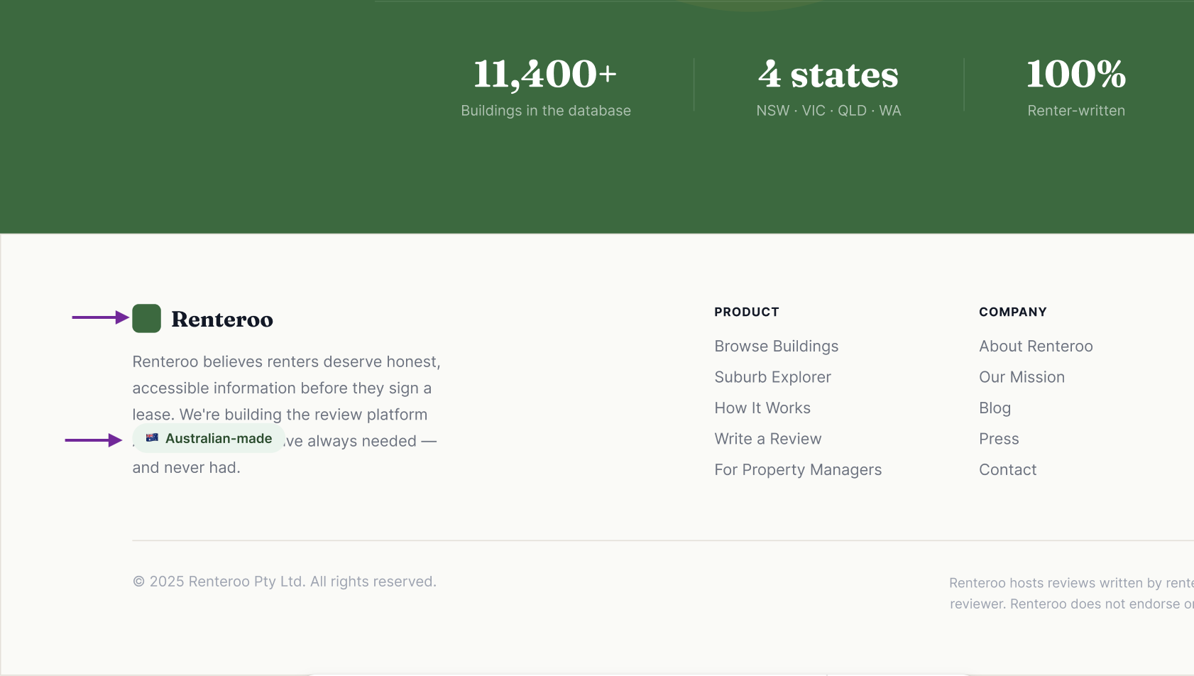
renteroo.csswith path in a comment for easy portfolio rehosting
Emotional target: Calm confidence: quiet authority, warm but not playful.
References: Airbnb (card warmth, human trust signals, generous radius) + Apple (whitespace discipline, restrained colour).
Key decisions:
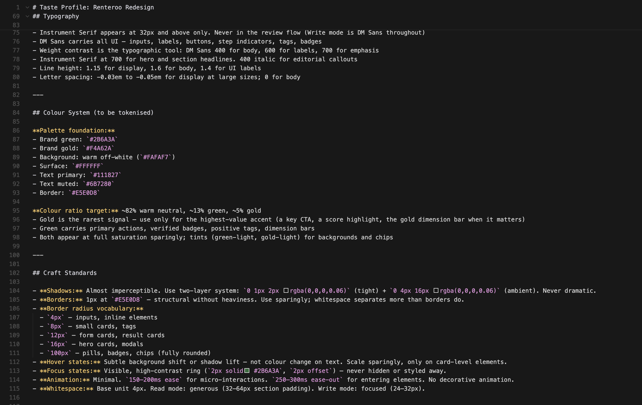
- Typography: Source Serif 4 (display, 32px+ only) + DM Sans (all UI): Instrument Serif was initially chosen but replaced after user feedback that it read too narrow
- Colour ratio: ~82% warm neutral / ~13% green / ~5% gold — gold is the rarest signal so it hits hardest
- Shadows: almost imperceptible two-layer (Apple restraint, not Airbnb card lift)
- Quality level: Production - every component resolved, not rough prototype
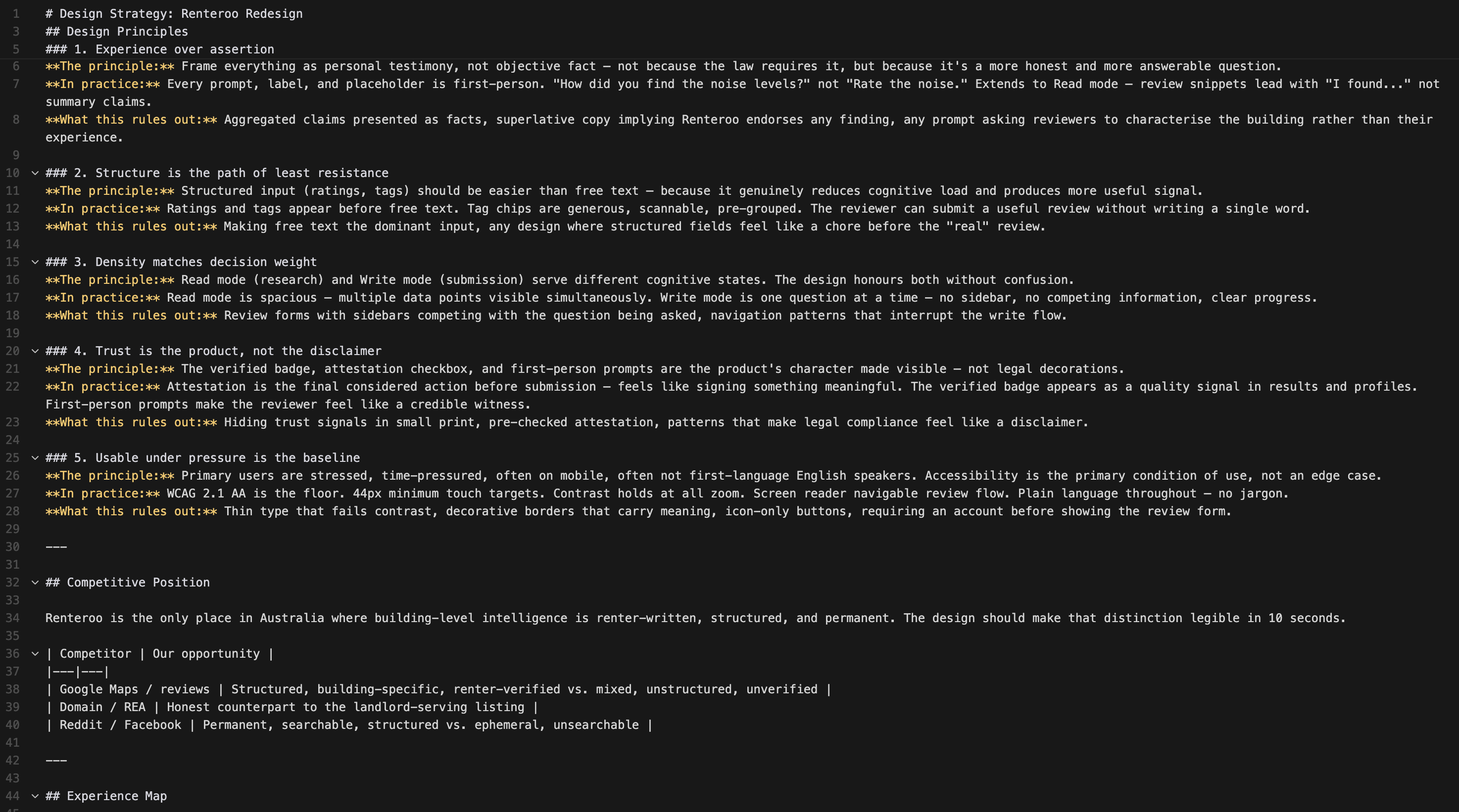
The legal Facilitator Principles were translated into genuine design principles — opinionated, testable, actionable.
- Experience over assertion — first-person framing throughout, not just in forms
- Structure is the path of least resistance — ratings and tags before free text
- Density matches decision weight — Read mode spacious; Write mode focused
- Trust is the product, not the disclaimer — attestation is a feature, not a warning
- Usable under pressure is the baseline — WCAG 2.1 AA is the floor; the primary user is stressed and mobile
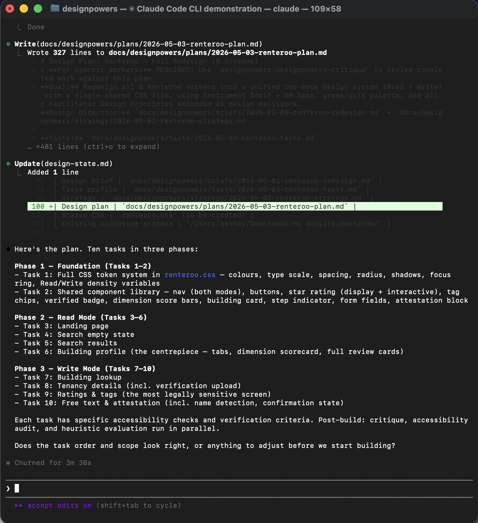
The design plan broke the work into 10 tasks with explicit accessibility checks and verification criteria for each.
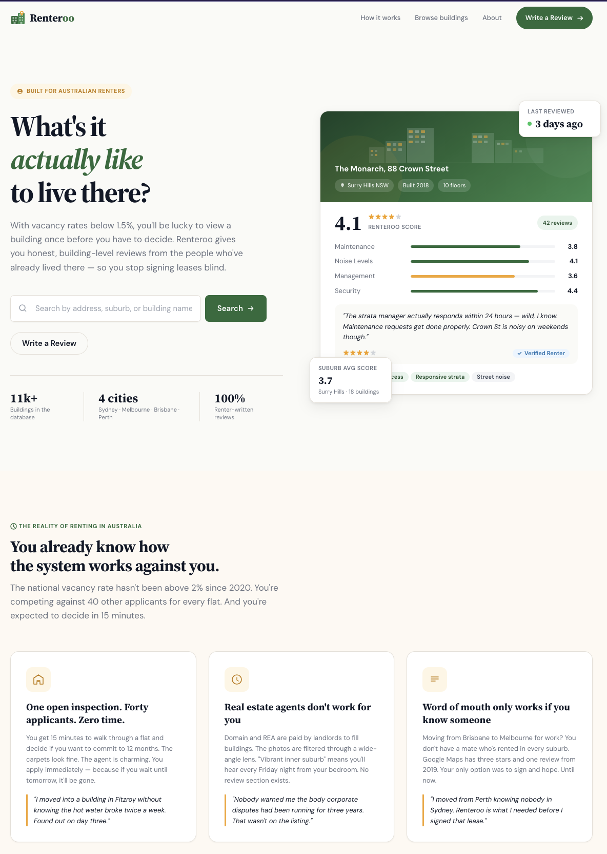
All screens link to a single renteroo.css with the full token system, shared components,
and a prefers-reduced-motion query. The building profile is the new centrepiece of the Read
mode flow.
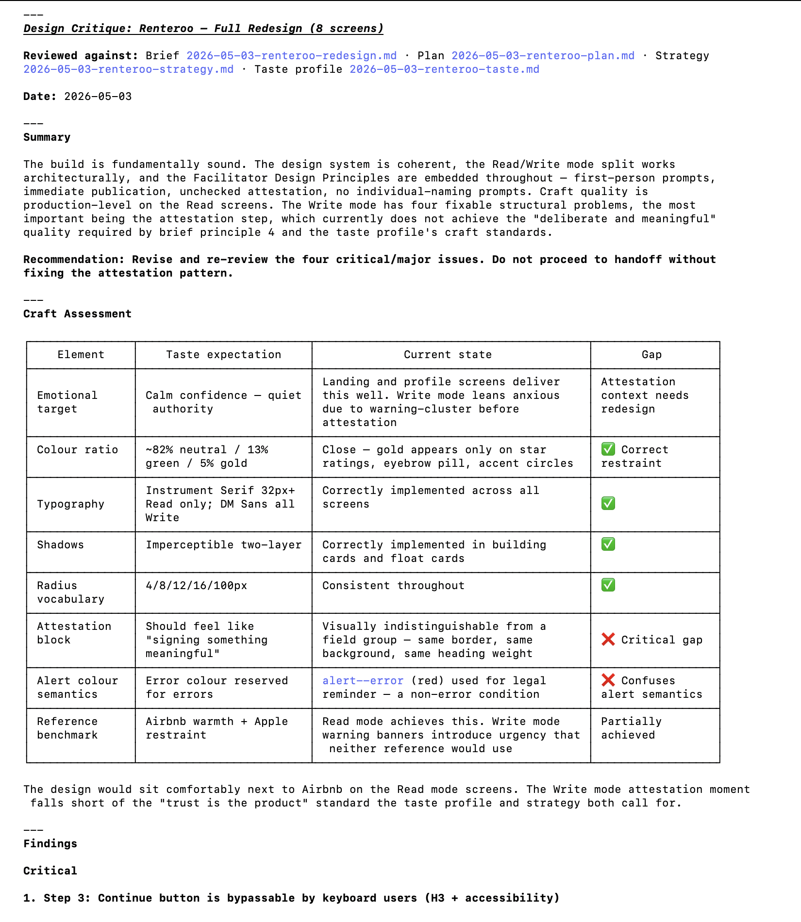
Three review agents ran in parallel: design-critic (brief alignment), heuristic-evaluator (Nielsen's 10 on the write flow), and accessibility-reviewer (WCAG 2.1 AA across all 8 screens). 4 critical, 3 major, 5 minor findings.
| Finding | Severity | Source |
|---|---|---|
Step 3 Continue gate bypassable by keyboard (<a> with
aria-disabled)
|
Critical | Heuristics + A11y |
| Attestation block visually identical to a form field — not distinguished | Critical | Critic + Taste |
Legal reminder used alert--error (red) for a non-error condition |
Critical | Critic |
| Step 2 Continue ungated — move-in dates silently skippable | Critical | Heuristics |
| Star rating hover shows no label preview before commit | Major | Heuristics |
| Star ratings have no arrow-key navigation | Major | A11y |
Add-building form has no validation before selectBuilding() |
Major | Heuristics |
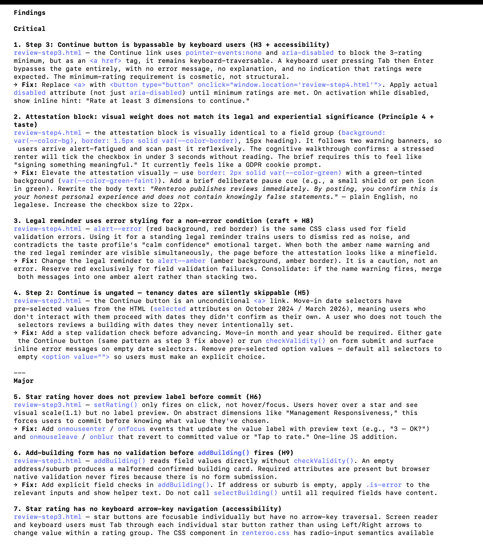
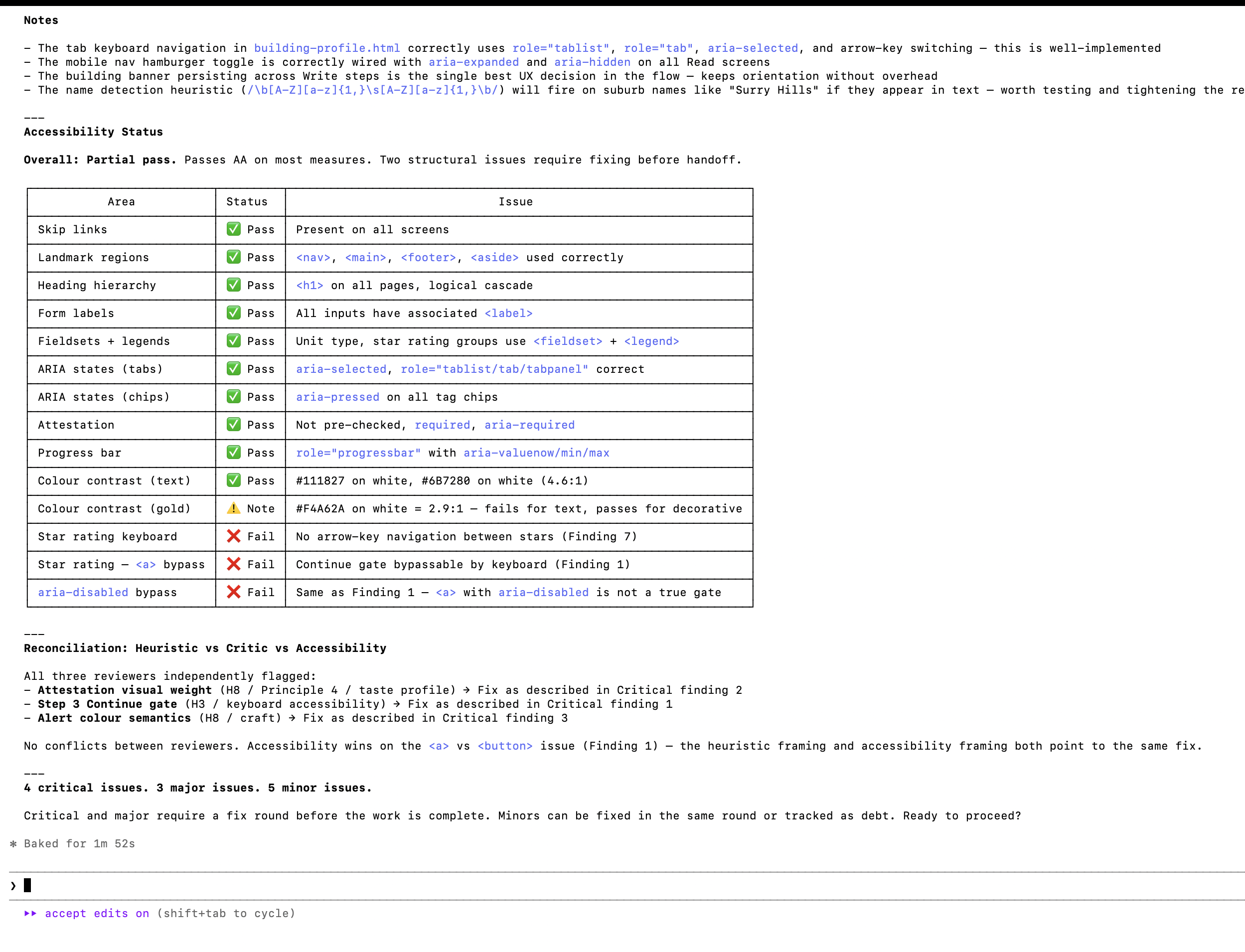
Claude then proceeded to fix the issues found in the heuristic evaluation. Highlights:
- Attestation elevated: green border, shield icon, plain-English body copy replacing legal register. The block now looks and feels like the most important action on the page.
- Continue button bug:
<a>replaced with<button>; activation blocked until 3+ dimensions rated; inline error hint on attempted early advance. - Alert semantics: legal reminder changed from red (
alert--error) to amber. Red reserved for validation errors only. - Step 2 dates: pre-selected option values removed; move-in fields required before Continue activates.
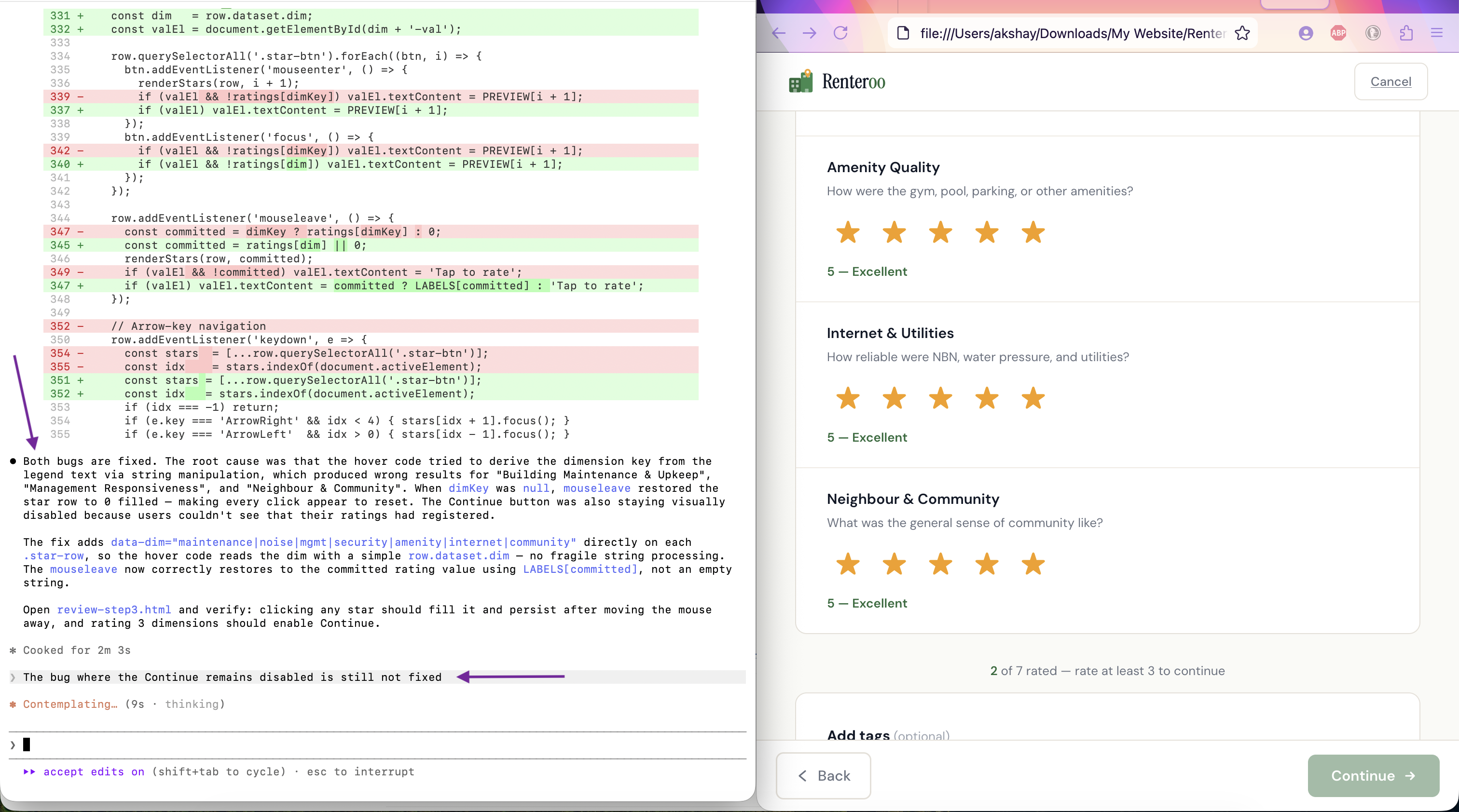
Next, I uncovered six bugs by testing the prototype in the browser.
The bug where the Continue button would not get enabled at Step 3 of the review process was frustrating. I had to prompt Claude thrice to get it fixed. All 3 times, Claude told me it had fixed the issue.
| Bug | Root cause | Fix |
|---|---|---|
| Star rating clicks appeared to do nothing | Hover code derived dim key from legend text via string matching — failed for "Building
Maintenance", "Management Responsiveness", "Community". mouseleave reset stars to 0
on those rows. |
Added data-dim attribute to each .star-row; hover code reads
row.dataset.dim directly
|
| Continue button never enabled after rating 3 dimensions | updateProgress() first set rated-count.textContent, then replaced
the parent with note.innerHTML, destroying the span. Next call:
null.textContent — silent TypeError halted execution before button could update.
|
Removed the redundant textContent line; count is embedded in the
innerHTML string
|
| Counter showed "2 rated" on page load | Demo values maintenance:4, noise:3 pre-populated in the ratings
object; is-filled classes baked into HTML |
Reset all ratings to 0; removed is-filled classes and pre-set labels |
| Verified Renter badge broke into 2 lines | Badge container lacked flex-shrink:0 and badge text had no
white-space:nowrap
|
Added both; added min-width:0 to left column so it yields space |
| Uploaded file showed broken state | No onchange handler on the file input; no uploaded-state UI existed |
Added handleFileUpload() and removeFile() functions; added green
confirmation card with filename, size, and remove button |
| Dashed upload area border broken | <label> is inline by default; border, padding, and text-align don't render
as a block |
Added display:block to .file-upload-area |
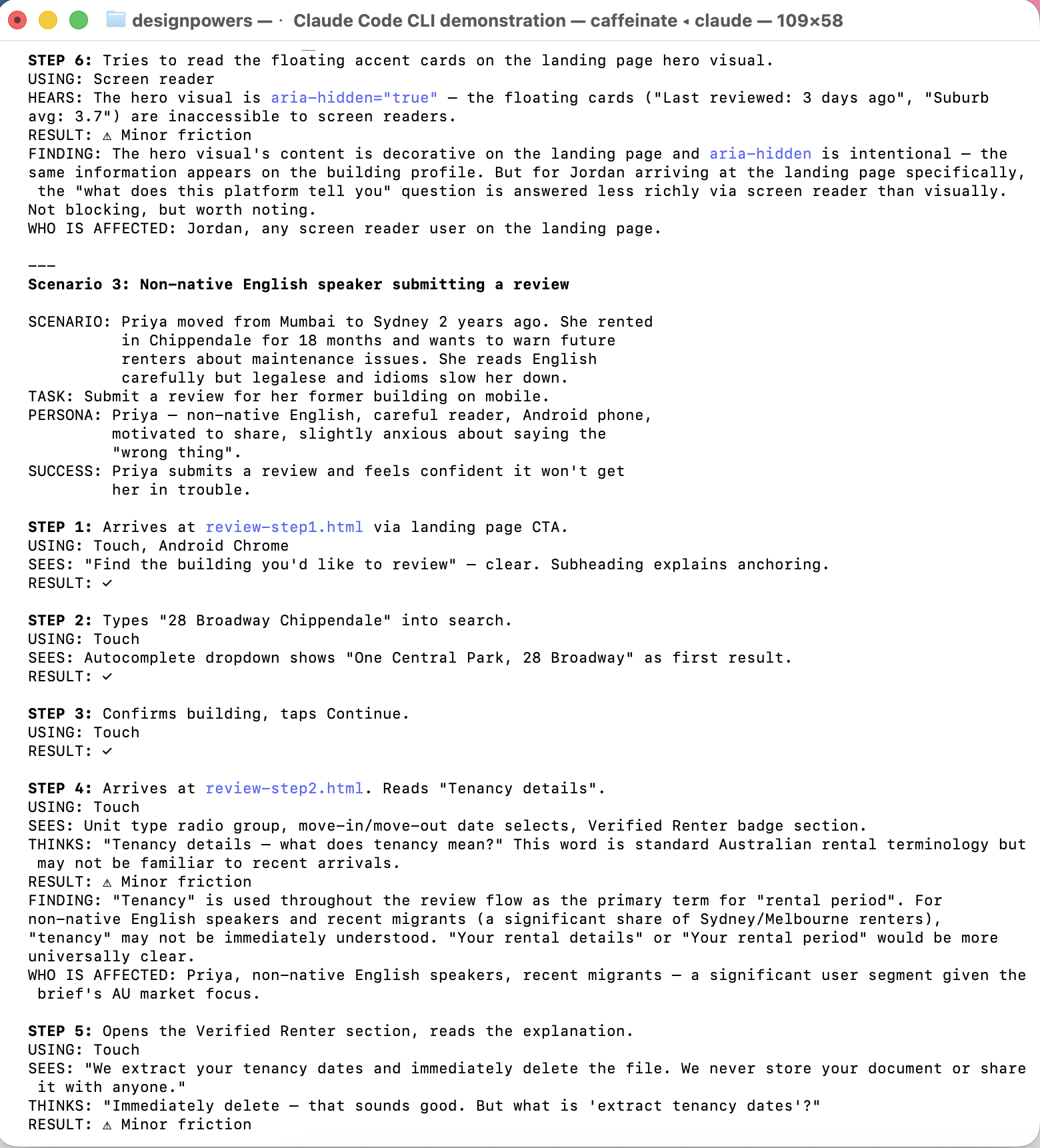
DesignPowers walked through each key flow as four personas, then produced a barrier matrix.
| Task | Maya (mobile) | Jordan (low vision) | Priya (ESL) | Marcus (keyboard) |
|---|---|---|---|---|
| Find building via search | ✓ | ✓ | ✓ | ✓ |
| Landing page search | ⚠ extra step | ⚠ | ⚠ | n/a |
| Back to results on mobile | ⚠ browser back | ✓ | ✓ | ✓ |
| Complete star ratings | ✓ | ✓ | ✓ | ✓ arrow keys |
| Submit review | ✓ | ✓ | ✓ | ✓ |
Fixes applied: Search bar added directly to landing page hero. Breadcrumb bar made sticky on mobile. "Tenancy details" renamed to "Rental details" for plain English. Attestation phrasing simplified ("anything you know to be untrue").
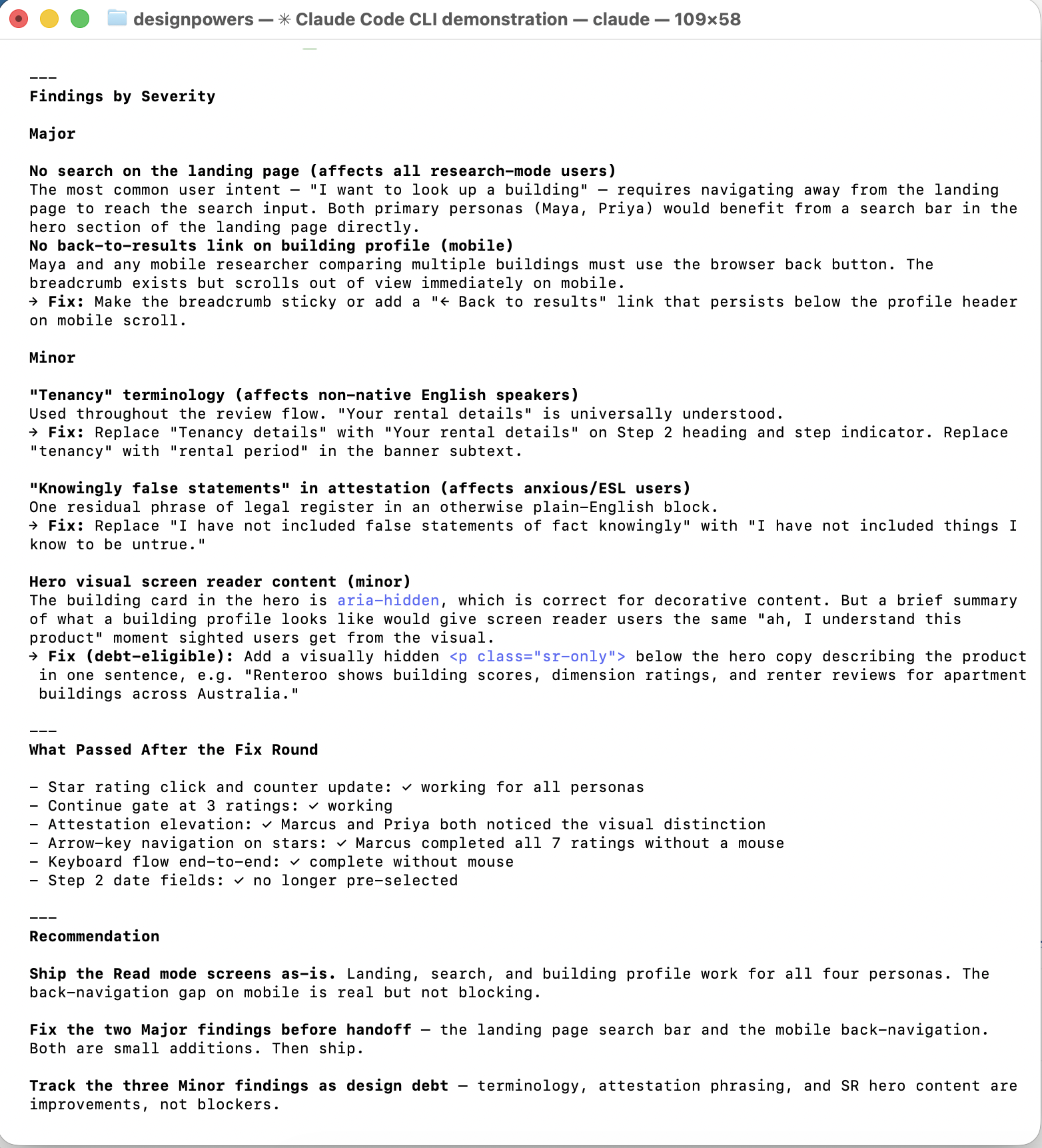
One blocker identified and resolved before handoff: prefers-reduced-motion was not
implemented to aid users with motion sensitivity. A single media query was added to
renteroo.css disabling all transitions for
users who have requested reduced motion in their system preferences.
All other checks passed: heading hierarchy, skip links, form labels, ARIA roles, focus rings, keyboard navigation end-to-end, colour contrast (WCAG 2.1 AA), Facilitator Design Principles embedded throughout.
Verdict: Ready for handoff.
All 8 screens are live and browseable below. They are categorized by Read vs. Write mode: "Read" means the pages when a user would consume content, that is, read reviews. "Write" means the pages when a user would create or edit content, like submitting a review.
The most unexpected thing about Phase 1 was how much design work happened in conversation and not in a tool. The legal deep dive shaped the product brief, and first-person framing on every form field was a direct output of understanding what "publisher liability" actually means.
Phase 2 tested something different: whether a structured multi-agent workflow produces meaningfully better design than a single-pass build. The answer, from this project, is "somewhat". The critique findings, heuristic evaluation and synthetic user testing were certainly useful in surfacing issues. But the redesign over Phase 1 wasn't dramatically different, in spite of getting a lot of my input around design taste.
There was also real value in having created actual HTML/CSS prototypes that I could interact with, poke at, and test in the browser. If this was a real product, it would have made a handoff to engineering much smoother.
- Translating hard constraints (legal, accessibility) into design decisions
- Running parallel review agents without losing coherence
- Surfacing language friction via persona-based testing
- Catching interaction bugs that design review misses
- Real users in a testing session — synthetic personas don't produce true surprises
- Seeing the screens on real devices at real scale
- Aesthetic taste decisions that require lived cultural context
- The information you get from watching someone actually fail at a task during user testing